~ 4 Minute Read.
This is the third post in a series about the virtual reality escape room project I did together with Daniel Bogenrieder and Roxanne Low at the University of Konstanz.
Augmented Virtual Reality
I’ll be frank: current generation augmented reality headsets are far from our dream of what augmented reality should look like. Especially stability of the augmented image is a huge problem, everything is swimming around, not actually rooted where it should be.
Hence, it is way less fun than it could be. Since our escape room was in virtual reality with the HTC Vive Pro and we matched the real room 1:1, basically trying to replicate reality, we were able to create perfect augmented reality, though.
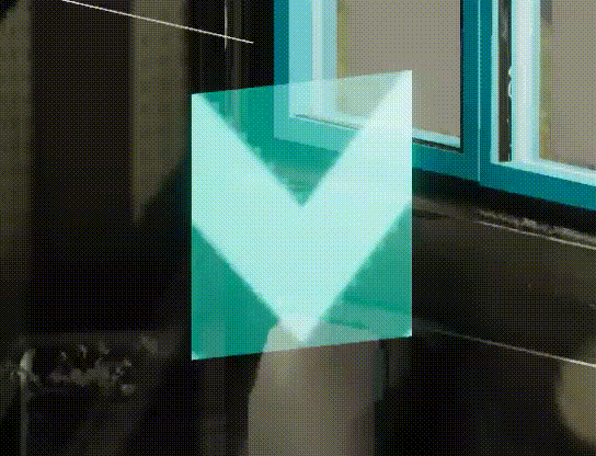
The above gif shows one of our holograms that would get activated once you put on a virtual augmented reality headset to enter augmented virtual reality 1. The animation played there is just a uv texture offset, no shader magic in the animation. To be able to have different colors with similar patterns on them, the input of the shader is a mask, though, so that you can specify the two colors that should be rendered in the white/black pixels of the mask. We didn’t actually use this feature of the shader in the end though.
Crispy VR Text in Unity
For the longest time people have been complaining about how unreadible text is in virtual reality. Even with many counter examples to prove it (We even made a Speedreading Game at Vhite Rabbit!), people still accept this as a fact implying the rule of “avoid text in VR”.
In my oppinion it is a matter of how the text is rendered. Of course tiny or undersampled text is unreadible. How about making it bigger or oversampling it instead then? Other options are mesh fonts, as they are anti-aliased by MSAA—they are not widely available, though.
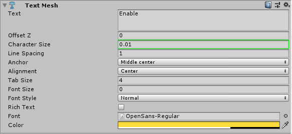
In Unity it is a matter of turning up the font size and scaling down the characters again. This will create a higher resolution font texture, hence crispy crispy text!
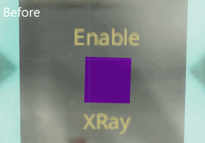
To enable this you need to adjust a settings in two panels: the font settings and the text mesh settings.

Outside Rendering
As the room we were replicating in VR had windows, we had two options: render the outsides of the window or put down the blinds.
Obviously the later is cheap and we were going to this properly… anecdote on the side: in our final presentation the blinds were actually down in the real room, so it would have matched the real room more accurately to not have done so.
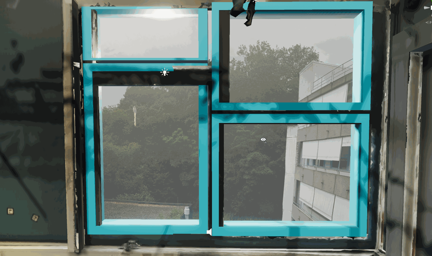
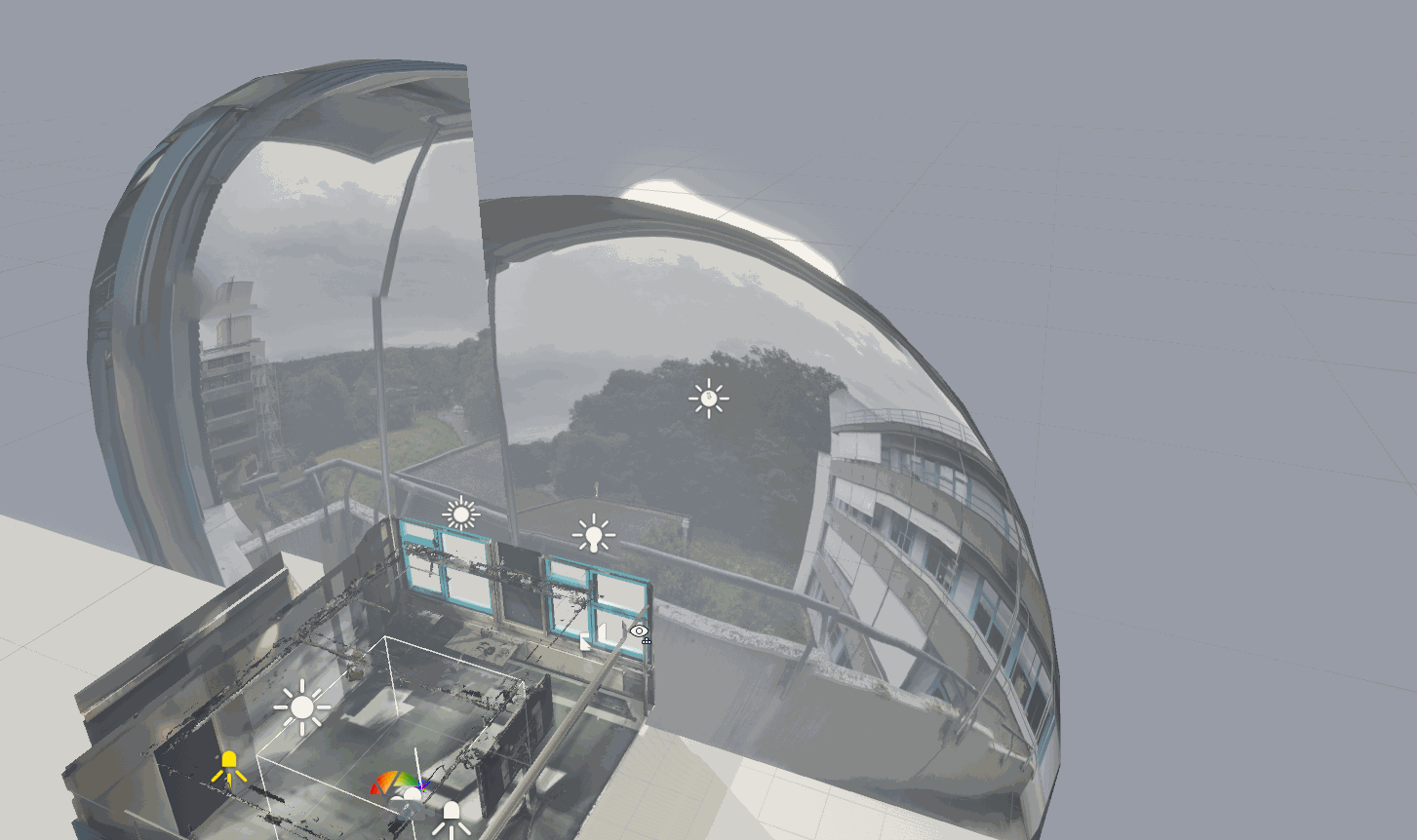
As noone was willing to model the forest and buildings that were to be seen outside, we instead took a set of two rough 180° images with a smartphone. Then one of these would each surround a set of windows as seen in the following image:
One problem emerges from this: the hemispheres need to be big enough for you to perceive them at infinite distance (where stereo vision turns into monocular), but then they overlap!
A custom shader solved this for us: a ray cast from the shaded fragments world position through the plane of the windowed wall in direction of the view location would give us the instersection. If the intersection point’s X coordinate is left to the center of the wall, the point would be shown for the left hemisphere and discarded otherwise. Analogous for the right hemishere.
In practice this looks like this:
Up Next
Tomorrow I will go into the different interaction techniques and hardware we used for this project.
- 1
- Wow, that was fun to write. :P
Written in 30 minutes, gifs in 120 minutes, edited in 15 minutes.